'Web Dev, HTML, CSS, SVG, BootStrap'에 해당되는 글 45건
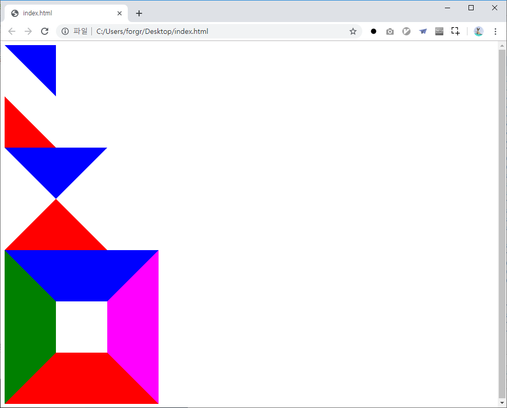
3dtransforms.desandro.com - carousel
Web Dev, HTML, CSS, SVG, BootStrap반응형

반응형
'Web Dev, HTML, CSS, SVG, BootStrap' 카테고리의 다른 글
| URI, URL, PATH, HASH, ORGIN, HREF (0) | 2021.09.01 |
|---|---|
| WEB.3D.desandro.Cube (0) | 2019.08.19 |
| Online Tutorials.Text Changing Animation (0) | 2019.08.19 |
| Online Tutorials.4Card.Rotate (0) | 2019.08.18 |
| Online Tutorials.4Card.Blur (0) | 2019.08.17 |
WEB.3D.desandro.Cube
Web Dev, HTML, CSS, SVG, BootStrap반응형
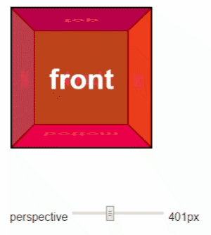
참고 : https://3dtransforms.desandro.com/cube
Cube · Intro to CSS 3D transforms
Cube Cards are a good start for working with 3D transforms, but they only show off 3D in transition. To show off 3D at rest, we’ll have to create true 3D objects: prisms. We’ll start with a cube. The markup for the cube is similar to the card. This time we
3dtransforms.desandro.com

반응형
'Web Dev, HTML, CSS, SVG, BootStrap' 카테고리의 다른 글
| URI, URL, PATH, HASH, ORGIN, HREF (0) | 2021.09.01 |
|---|---|
| 3dtransforms.desandro.com - carousel (0) | 2019.08.26 |
| Online Tutorials.Text Changing Animation (0) | 2019.08.19 |
| Online Tutorials.4Card.Rotate (0) | 2019.08.18 |
| Online Tutorials.4Card.Blur (0) | 2019.08.17 |
Online Tutorials.Text Changing Animation
Web Dev, HTML, CSS, SVG, BootStrap반응형
반응형
'Web Dev, HTML, CSS, SVG, BootStrap' 카테고리의 다른 글
| 3dtransforms.desandro.com - carousel (0) | 2019.08.26 |
|---|---|
| WEB.3D.desandro.Cube (0) | 2019.08.19 |
| Online Tutorials.4Card.Rotate (0) | 2019.08.18 |
| Online Tutorials.4Card.Blur (0) | 2019.08.17 |
| CSS Animation : @keyframes Rule & animation (0) | 2019.08.14 |
Online Tutorials.4Card.Rotate
Web Dev, HTML, CSS, SVG, BootStrap반응형

반응형
'Web Dev, HTML, CSS, SVG, BootStrap' 카테고리의 다른 글
| WEB.3D.desandro.Cube (0) | 2019.08.19 |
|---|---|
| Online Tutorials.Text Changing Animation (0) | 2019.08.19 |
| Online Tutorials.4Card.Blur (0) | 2019.08.17 |
| CSS Animation : @keyframes Rule & animation (0) | 2019.08.14 |
| CSS Animation : 3D Transform (0) | 2019.08.14 |
Online Tutorials.4Card.Blur
Web Dev, HTML, CSS, SVG, BootStrap반응형

반응형
'Web Dev, HTML, CSS, SVG, BootStrap' 카테고리의 다른 글
| Online Tutorials.Text Changing Animation (0) | 2019.08.19 |
|---|---|
| Online Tutorials.4Card.Rotate (0) | 2019.08.18 |
| CSS Animation : @keyframes Rule & animation (0) | 2019.08.14 |
| CSS Animation : 3D Transform (0) | 2019.08.14 |
| CSS Animation : Transition (0) | 2019.08.14 |
CSS Animation : @keyframes Rule & animation
Web Dev, HTML, CSS, SVG, BootStrap반응형
참고 : http://www.beautifulcss.com/archives/2724
# 기본 구성.@keyframes
@keyframes myAnimation {
  0%   { opacity: 0; }
  100% { opacity: 1; }
}

div { animation: myAnimation 5s infinite; }
@keyframes myAnimation {
0% { font-size: 10px; }
25% { font-size: 20px; }
50% { font-size: 30px; }
70% { font-size: 20px; }
100% { font-size: 10px; }
}@keyframes myAnimation {
from { font-size: 10px; }
to { font-size: 20px; }
}
# 기본 구성.animation
.div1 {
   animation-name: myAnimation;
   animation-duration: 4s;
   animation-iteration-count: 10;
   animation-direction: alternate;
   animation-timing-function: ease-out;
   animation-fill-mode: forwards;
   animation-delay: 2s;
}
| 속성 | 값 |
||
| name |
움직임을 줄 모양새 즉, @keyframes Rule에서 선언한 애니메이션 이름을 넣어줍니다. 지금까지의 예문으로 보자면 myAnimation이 되겠죠. |
||
| duration |
@keyframe Rule에서 선언한 0%부터 100%까지의 움직임을 몇 초에 걸쳐 구현할 지 선언합니다. (1s는 1초, 1ms는 0.1초입니다) |
||
| iteration-count |
애니메이션을 얼마나 반복시킬 지 정의합니다. infinite를 기재하면 무한 반복합니다. |
||
| direction |
애니메이션의 반복이 최소 2회 이상일 경우, 한 사이클(0% 부터 100%)이 종료되고 나서 다음 반복 때는 어떤 방향으로 움직임을 이어 나갈지 정의합니다. normal, alternate, reverse, alternate-reverse가 있습니다.
|
||
| timing-function |
키프레임 간의 영향력을 조절하여, 움직임에 긴장감을 줄 수 있습니다. Easing이라고 하는 이 기법에 대한 설명은 여기에서는 자세히 다루지 않습니다. 문서 하단을 참조하세요. |
||
| fill-mode |
한 사이클의 애니메이션이 종료되고 난 후, 애니메이션의 상태를 정의합니다. 개념 자체는 간단한데 설명하기가 정말 애매모호한 속성입니다. 따라서 여기서는 원론적인 설명만 하고, 더 자세히 알아보고 싶다면 문서 하단을 참조하세요.
|
||
| delay | 애니메이션의 시작 지연시간을 정의합니다. 1초는 1s, 0.1초는 1ms 식으로 선언하면 됩니다. | ||
fill-mode 예제
@keyframes myAnimation {
  0%    { left: 0px }  /* @keyframes Rule에서 선언한 위치 */
  100%  { left: 100px }
}

div {
	left: 20px;        /* selector에서 선언한 위치 */
	animation-name: myAnimation;
	animation-duration: 2s;
	animation-fill-mode: forwards;
}
# 단축형 작성법
순서)
animation : name duration delay iteration-count direction fill-mode
Ex)
animation: myAnimation 1s 2s 3 alternate backwards
# 복수 선언
.div1 {
   animation:
      myAnimation_01 2s infinite,
      myAnimation_02 1s;
}
# Step()
@keyframes myAnimation {
  0% { left: 0; }
  100%   { left: 100px; }
}

.div1 {
  animation: myAnimation 10s steps(10) infinite;
}
Ex>
http://jsfiddle.net/simurai/CGmCe/light/
.hi {
    width: 50px;
    height: 72px;
    background-image: url("http://s.cdpn.io/79/sprite-steps.png");

    -webkit-animation: play 1.8s steps(10) infinite;
       -moz-animation: play 1.8s steps(10) infinite;
        -ms-animation: play 1.8s steps(10) infinite;
         -o-animation: play 1.8s steps(10) infinite;
            animation: play 1.8s steps(10) infinite;
}

@-webkit-keyframes play {
   from { background-position:    0px; }
     to { background-position: -500px; }
}

@-moz-keyframes play {
   from { background-position:    0px; }
     to { background-position: -500px; }
}

@-ms-keyframes play {
   from { background-position:    0px; }
     to { background-position: -500px; }
}

@-o-keyframes play {
   from { background-position:    0px; }
     to { background-position: -500px; }
}

@keyframes play {
   from { background-position:    0px; }
     to { background-position: -500px; }
}

<img src="http://s.cdpn.io/79/sprite-steps.png" />
<div class="hi"></div>

반응형
'Web Dev, HTML, CSS, SVG, BootStrap' 카테고리의 다른 글
| Online Tutorials.4Card.Rotate (0) | 2019.08.18 |
|---|---|
| Online Tutorials.4Card.Blur (0) | 2019.08.17 |
| CSS Animation : 3D Transform (0) | 2019.08.14 |
| CSS Animation : Transition (0) | 2019.08.14 |
| Online Tutorials.Border.Gradient Light (0) | 2019.08.10 |
CSS Animation : 3D Transform
Web Dev, HTML, CSS, SVG, BootStrap반응형
참조 : http://www.beautifulcss.com/archives/2270
메소드설명
| translate3d(x,y,z) | 객체의 위치를 가로(x), 세로(y), 깊이(z) 방향으로 정의하여 이동시킵니다. 단위로는 px, %, em 따위를 사용할 수 있습니다. 예를들어, translate(60px, 60px, 60px)은 객체를 우측으로 60px, 하단으로 60px, 그리고 사용자와 60px만큼 가까운 위치로 이동시킵니다. 또한, 양수와 음수를 사용할 수 있습니다. 더 자세한 내용은 추후 기술합니다. | ||
| translateX(n) | 객체의 위치를 가로 방향으로만 이동시킵니다. translateX(100px)은 우측으로 100px만큼 이동합니다. -100px과 같이 음수로 기재하면 반대방향인 좌측으로 100px만큼 이동합니다. | ||
| translateY(n) | 객체의 위치를 세로 방향으로만 이동시킵니다. -100px과 같이 음수로 기재하면 반대방향인 상단으로 100px만큼 이동합니다. | ||
| scale3d(x,y,z) | 객체의 세 방향을 한번에 늘이거나 줄일 수 입니다. | ||
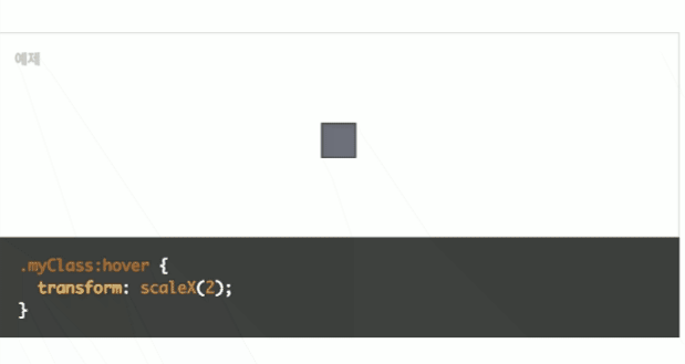
| scaleX(n) | 객체를 x축 중심으로 늘이거나 줄입니다. | ||
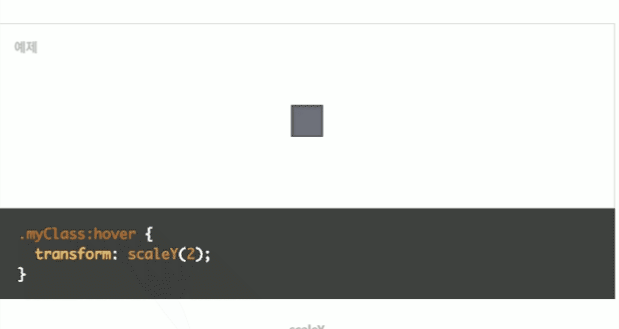
| scaleY(n) | 객체를 y축 중심으로 늘이거나 줄입니다. | ||
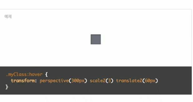
| scaleZ(n) | 객체를 z축 중심으로 늘이거나 줄입니다. CSS에는 두께라는 개념이 없습니다. | ||
| rotate3d(x,y,z) | 객체의 세 방향을 한번에 회전 시킵니다. | ||
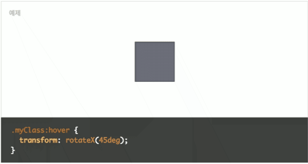
| rotateX(n) | X축을 중심으로 객체를 회전시킵니다. 아래 종합예제에서 보여줍니다. | ||
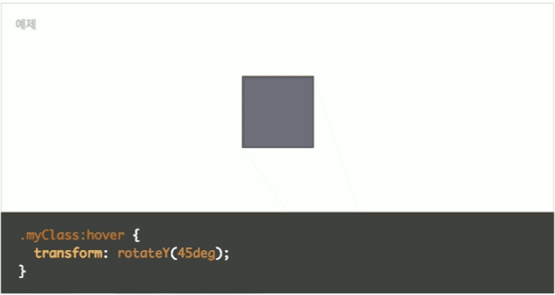
| rotateY(n) | Y축을 중심으로 객체를 회전시킵니다. 아래 종합예제에서 보여줍니다. | ||
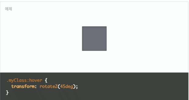
| rotateZ(n) | 2D Transform의 Rotate와 동일합니다. | ||
| perspective(n) | 객체를 바라보는 원근을 입니다. 화면을 바라보는 사용자로부터 얼마나 멀리에 위치하는가를 나타냅니다.px을 사용하며, 수치가 낮을수록 가깝기 때문에 왜곡도 심하게 일어납니다. 자세한 내용은 추후 다시 설명합니다. | ||
| matrix3d(nx16) | 2D Transform에서 알아봤듯이, 모든 값을 한번에 지정할 수 있지만, 16개의 값이 존재하며, 여기서 다룰 수 없는 영역입니다. | ||
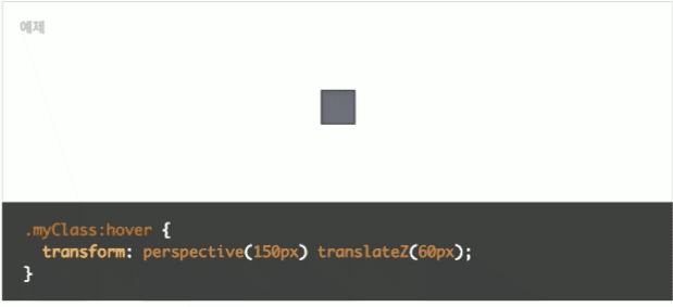
# translateZ 의 이해.
기본 좌표계의 카메라를 기준으로, 사용자와 가까워지느냐(=사물이 커진다) 멀어지느냐로 이해하면 편하다.
다만 카메라를 바꾸면 달라질 수 있다.
[ 중요 ] Perspective (심도, 원근)
- 3D 에서 가장 중요한 요소 : transform, perspective
- translateZ 는 perspective 값 범위 이내에서 조절되도록 하자.
.myClass:hover {
  transform: perspective(150px) translateZ(60px);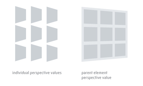
}| Individual perspective values | hover 같이 단일 형태로만 적용 |
| Parent element perspective value | 하위 객체다수를 포함하는 부모객체에 적용시 일괄 적용 |
# Pespective 값 차이에 따른 심도 변화
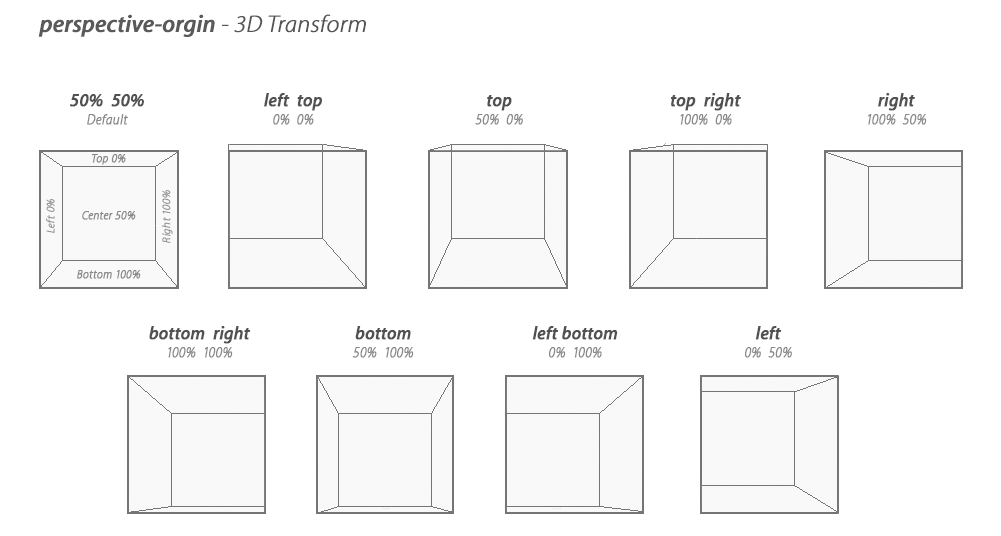
참조 : https://3dtransforms.desandro.com/perspective
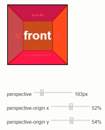
# Perspective-orgin
부모 객체 하나에만 선언한다.
.camera {
    perspective: 70px;
    perspective-orgin: 50% 50%
}
# transform-style : flat
flat - (default) 자식객체한테 3D 명령들이 동작하지 않음.
Ex> 아래 코드 마지막 rotateX(-30deg); 가 동작하지 않는다.
.parent {
    margin: 0 auto;
    width: 300px;
    height: 300px;
    border: 1px solid #ddd;
    transform: rotateX(45deg);
    transform-style: flat
}

.child {
    margin-top: 40px;
    padding: 100px 0;
    width: 100%;
    background-color: #ddd;
    text-align: center;
    color: #999;
    transform: rotateX(-30deg);
}

<div class="container">
    <div class="parent">
        <div class="child">
            I'm your sun.
        </div>
    </div>
</div>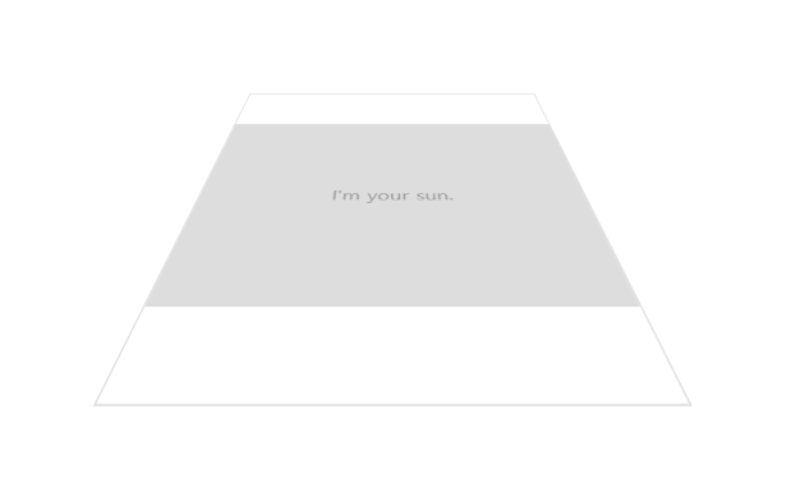
# transform-style : preserve-3d : 3D
.parent {
    margin: 0 auto;
    width: 300px;
    height: 300px;
    border: 1px solid #ddd;
    transform: rotateX(45deg);
	transform-style: preserve-3d;
}

.child {
    margin-top: 40px;
    padding: 100px 0;
    width: 100%;
    background-color: #ddd;
    text-align: center;
    color: #999;
    transform: rotateX(-30deg);
}

<div class="container">
    <div class="parent">
        <div class="child">
            I'm your sun.
        </div>
    </div>
</div>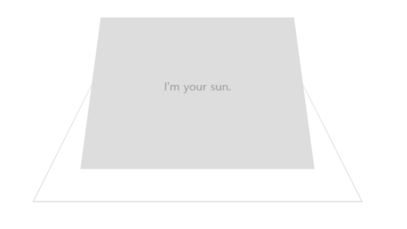
# backface-visibility: hidden
- 중요
- backface-visibility: visible 시에는, rotateX(180deg) 시 "앞면을 뒤에서 보는 것"처럼 된다. (뒷면이란 건 없다)
- backface-visibility: hidden 시에는, rotateX(180deg) 시 객체가 없는 것처럼 투명하게 된다.
반응형
'Web Dev, HTML, CSS, SVG, BootStrap' 카테고리의 다른 글
| Online Tutorials.4Card.Blur (0) | 2019.08.17 |
|---|---|
| CSS Animation : @keyframes Rule & animation (0) | 2019.08.14 |
| CSS Animation : Transition (0) | 2019.08.14 |
| Online Tutorials.Border.Gradient Light (0) | 2019.08.10 |
| Online Tutorials.Icon Button.Animate Lightening Button (0) | 2019.08.10 |
CSS Animation : Transition
Web Dev, HTML, CSS, SVG, BootStrap반응형
참조 : http://www.beautifulcss.com/archives/2026
# Transition
- 제한적 애니메이션.
- 기존의 객체 속성이 변할때, 천천히 변하게 한다.
- 모양 왜곡 없음. 동작반복 없음.

.ex-01 {
    display: inline-block;
    margin: 0;
    padding: 20px;
    text-decoration: none;
    font-size: 12px;
    color: white;
    background-color: black;
    transition: all 1s;
}

.ex-01:hover {
    padding: 30px;
    color: yellow;
    background-color: red;
}
div { transition: property duration timing-function delay; }
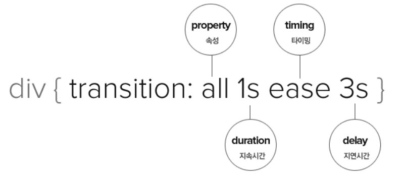
# 각각의 속성이 따로 transition 을 가질 경우
아래와 같이, 속성별로 따로 줄 수 있다.
div {
    transition: background 2s ease 1s,
                padding 1s linear 2s;
}
# 여러 속성이 동일 transition 을 가질 경우
div {
    transition-property: width, color;
    transition-duration: 1s;
    transition-timing-function: ease;
    transition-delay: 3s;
}
transition 속성 설명속성값
| transition-property | transition 효과를 적용할 속성들을 나열합니다. 2개 이상일 경우는 쉼표(,)로 구분합니다. | |
| transition-duration | transition 효과의 지속 시간을 표기합니다. 1s는 1초입니다. 만일 1초로 설정했다면, 모든 변화가 1초 안에 끝납니다. | |
| transition-timing-function | 변화의 시작과 끝 타이밍을 정의합니다. 예를들면, 빠르게 시작해서 느리게 끝나는 등의 효과가 그것입니다. | |
| transition-delay | 효과의 지연시간을 정의합니다. 만일 3초(3s)로 설정했다면, 페이지가 로드되고 나서 3초 후에 transition 효과가 시작됩니다. | |
# 여러 속성이 일부 transition 만 가질 경우
- 아래 코드에서 "각 속성의 항목이 모두 4개" 이며, 순서가 같은 항목끼리 동작한다.
div {
    transition-property: width, height, border-width, color;
    transition-duration: 1s, 2s, 1s, 3s;
    transition-timing-function: ease ease-in ease-out linear;
    transition-delay: 3s, 1s, 1s, 2s;
}
# 타이밍
transition-timing-function 속성 설명속성값
| ease | 기본값입니다. 느리게 시작하여 점점 빨라졌다가 느리게 끝납니다. 일반적으로 이 속성을 사용하면 대부분의 움직임이 자연스러움을 갖습니다. | |
| linear | 모든 속도가 같은 등속 운동입니다. | |
| ease-in | 느리게 시작한 후 일정한 속도에 다다르면 그 상태로 등속 운동합니다. | |
| ease-out | 일정한 속도의 등속으로 시작해서 점점 느려지면서 끝납니다. | |
| ease-in-out | ease와 비슷합니다. 느리게 시작하여 느리게 끝납니다. | |
| cubic-bezier(n,n,n,n) | 처음과 끝의 속도를 0과 1 사이의 수치를 이용하여 4단계로 지정할 수 있습니다. 베지어(Bezier)라는 곡선 운동을 정의합니다. | |
# Example
.ex-02 {
    display: inline-block;
    margin: 0;
    width: 80px;
    height: 80px;
    line-height:80px;
    text-decoration: none;
    font-size: 12px;
    color: #999;
    background-color: #f4f4f4;
    border-width: 1px;
    border-style: solid;
    border-radius: 10%;
    border-color:#999;
    transition: width .2s ease,
				height .2s ease,
				line-height .2s ease,
				color .2s ease,
				font-size .2s ease,
				border .2s ease,
				background-color .2s ease,
				border-radius .2s ease .4s;
}

.ex-02:hover {
    width: 120px;
    height: 120px;
    line-height:120px;
    color: #ffcccc;
    font-size: 20px;
    border-width: 5px;
    border-color:#ff5e5d;
    background-color: #fa8382;
    border-radius: 50%;
}
반응형
'Web Dev, HTML, CSS, SVG, BootStrap' 카테고리의 다른 글
| CSS Animation : @keyframes Rule & animation (0) | 2019.08.14 |
|---|---|
| CSS Animation : 3D Transform (0) | 2019.08.14 |
| Online Tutorials.Border.Gradient Light (0) | 2019.08.10 |
| Online Tutorials.Icon Button.Animate Lightening Button (0) | 2019.08.10 |
| Online Tutorials.Text.Animate Lightening Text (0) | 2019.08.10 |
CSS Animation : 2D Transform
Web Dev, HTML, CSS, SVG, BootStrap/CSS반응형
참조 : http://www.beautifulcss.com/archives/2136
# Transform ( rotate / skew )
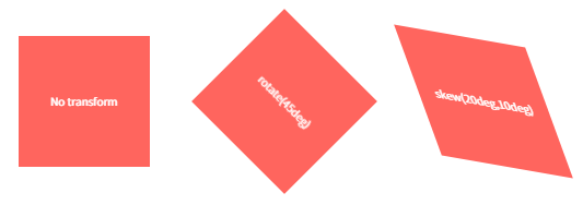
.myclass { transform: rotate(45deg) skew(10deg,0deg); }.ex-03 {
display:inline-block;
width: 120px;
height: 120px;
margin: 0 30px 20px 30px;
background-color: #ff655e;
color:#fff;
font-size:10px;
line-height: 120px;
}
.ex-03.rotate { transform: rotate(45deg); }
.ex-03.skew { transform: skew(20deg,10deg); }
2D Transform 메소드 정리함수설명
| translate(x,y) | 객체의 위치를 가로(x), 세로(y) 방향을 정의하여 이동시킵니다. 단위로는 px, %, em 따위를 사용할 수 있습니다. 예를들어, translate(100px, 100px)은 객체를 우측으로 100px, 하단으로 100px만큼 이동시킵니다. 또한, 양수와 음수를 사용할 수 있습니다. 이 부분은 아래를 더 읽어보세요. | |
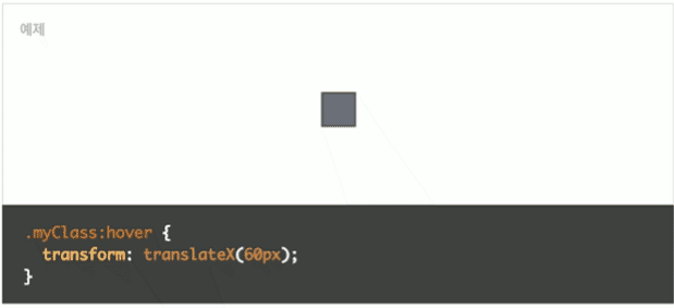
| translateX(n) | 객체의 위치를 가로 방향으로만 이동시킵니다. translateX(100px)은 우측으로 100px만큼 이동합니다. -100px과 같이 음수로 기재하면 반대방향인 좌측으로 100px만큼 이동합니다. | |
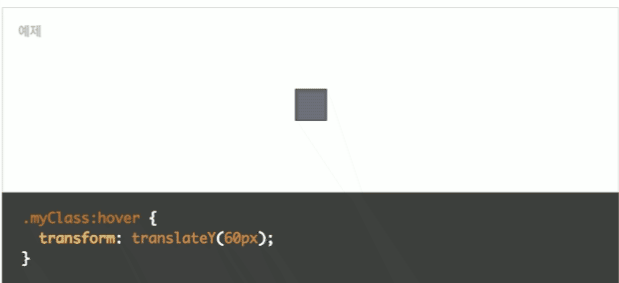
| translateY(n) | 객체의 위치를 세로 방향으로만 이동시킵니다. -100px과 같이 음수로 기재하면 반대방향인 상단으로 100px만큼 이동합니다. | |
| scale(x,y) | 객체의 크기를 늘이거나 줄일 수 입니다. x는 너비, y는 높이가 됩니다. x와 y는 0부터 1까지 사이의 숫자만 기재합니다. 1이 기본 크기, 2는 2배 크기, 3은 3배 크기이며, 0.9는 기본 크기의 90% 크기, 0.5는 절반 크기입니다. 0은 아예 화면에서 사라지고, 0.15는 기본 크기의 15% 크기입니다. translate와 같이 음수를 사용하지 않고 소숫점 단위의 숫자를 사용한다는 것에 유의하세요. 따라서, 너비와 높이 100px짜리 객체가 있을 경우, scale(2,0.5)를 적용했을 때는 너비 200px, 높이 50px로 변경됩니다. 대부분 객체의 크기는 미리 css의 width와 height 속성을 사용하여 정의를 하기 때문에, Transform에서의 scale() 함수에서는 미리 정해진 크기에 비례하여 늘이거나 줄이는 역할을 합니다. |
|
| scaleX(n) | 객체 x축 방향으로 늘이거나 줄입니다. | |
| scaley(n) | 객체의 y축 방향으로 늘이거나 줄입니다. | |
| rotate(angle) | 객체를 회전시킵니다. rotate(45deg)는, 객체를 시계방향으로 45도 돌립니다. 반시계 방향으로 돌리고 싶다면 rotate(-45deg)처럼 음수를 사용하세요. | |
| skew(x-angle,y-angle) | 객체를 기울입니다. 실제로 기울이는 것이 아니라, 선을 왜곡시켜 그렇게 보이게 하는 의미입니다. x는 수평축 기울임, y는 수직축 기울임입니다. skew(10deg, -10deg)와 같이 표기하며, 음수는 양수의 반대방향입니다. skew는 CSS 표준 초기 초안(Early Draft)에 명시되었다가 삭제된 비표준 함수입니다. 따라서 향후 확정된 권고안이 나오기 전까지는 사용을 자제하는 것이 좋습니다. |
|
| matrix(scaleX, tanY, tanX, scaleY, translateX, translateY) | Transform이 가지고 있는 모든 함수를 한꺼번에 정의할 수 있습니다. 다만, 각 수치의 단위가 달라지거나 아예 다른 단위를 넣어야 하는 등의 혼란스러움이 있기 때문에 설명을 잘 읽어야 합니다. 매트릭스를 잘 사용하면 입력해야 할 코드의 양이 줄겠죠. 구문을 좀 더 알기쉽게 작성하면, matrix(너비, 수직기울기, 수평기울기, 높이, 수평이동, 수직이동)입니다. 더 유심히 보아야 할 부분은 아래의 리스트를 참조하세요.
|
|
<!doctype html>
<html lang="en">
<head>
<meta charset="utf-8">
<title></title>

<style>
.ex-04
{
	position: relative;
	width: 128px;
	height: 128px;
	margin: 0 auto;
	border-radius: 1px;
	background-color: #e5eeee;
	box-shadow: 2px 2px 3px rgba(0, 0, 0, 0.2) inset, 0px 0px 0px 1px rgba(0, 0, 0, 0.05) inset;
}

.myClass
{
	width: 128px;
	height: 128px;
	background-color:#ffffff;
	border: 1px solid #000000;
	transition: transform 1s ease;
}
</style>

<style>
.myClass1:hover
{
  transform: translateX(60px);
}
.myClass2:hover
{
  transform: translateY(60px);
}
.myClass3:hover
{
  transform: translate(60px, 60px);
}
.myClass4:hover
{
  transform: scaleX(2);
}
.myClass5:hover
{
  transform: scaleY(2);
}
.myClass6:hover
{
  transform: scale(2, 2);
}
</style>
</head>


<body>
<div class="ex-04">
	<div class="myClass myClass1">transform: translateX(60px)</div>
</div>

<div class="ex-04">
	<div class="myClass myClass2">transform: translateX(60px)</div>
</div>

<div class="ex-04">
	<div class="myClass myClass3">transform: translateX(60px)</div>
</div>

<div class="ex-04">
	<div class="myClass myClass4">transform: translateX(60px)</div>
</div>

<div class="ex-04">
	<div class="myClass myClass5">transform: translateX(60px)</div>
</div>

<div class="ex-04">
	<div class="myClass myClass6">transform: translateX(60px)</div>
</div>

</body>
</html>
# 좌표계
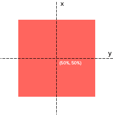
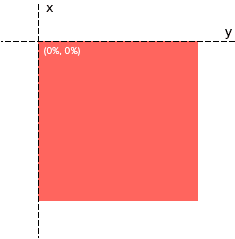
기준점
- 움직임이 발생시 움직이지 않는 고정점
- 기준점에 따라 객체가 움직인다.
- Syntax
transform-origin: 50% 50%- Example
.myClass {
    transform: rotate(360deg);
    transform-origin: 0% 0%
}
.myClass {
  transform: scale(2,2);
  transform-origin: 0px 0px;
}
# 주의할 점
- 웹 애니메이션은 Anti Aliasing 이 없다.
그래서 경계선 일그러짐 (=Jagged) 발생. 해결책은 outline: 1px solid transparent 추가
반응형
'Web Dev, HTML, CSS, SVG, BootStrap > CSS' 카테고리의 다른 글
| 2020-093.CSS.Font Size.폰트 크기.rem.em.px.vh/vw.ex/ch (0) | 2020.04.05 |
|---|---|
| CSS1,2,3 (0) | 2020.03.04 |
| CSS 변수 (0) | 2019.10.08 |
| (작성중) transition, transform (rotate, translate) (0) | 2018.10.26 |
| Div p 와 Div > p 의 차이점 (0) | 2018.06.03 |